With the touring skis gathering dust and the camping gear slumbering in dry bags, I’ve been using the obligatory indoors time to work on some side projects with friends. Here’s a run down, with some notes on what I’ve learned from each.
The Corona Calculator

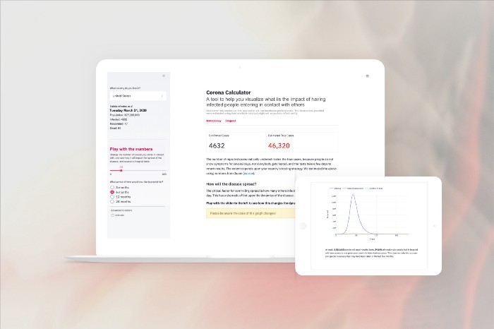
In the first weekend of lockdown we (Claudel Rheault, Salman Mohammed, and Pat Steeves) made the Corona Calculator, an interactive webapp which allows you to visualize the effects of different degrees of social distancing using a basic epidemiological model (SIR – Susceptible, Infected, Recovered). This was well received; we really struck a chord at a time when a lot of people were trying to grok whether lockdown was a good idea.

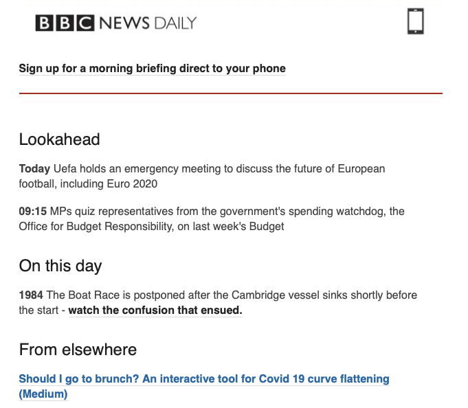
The Medium post was the most popular I’ve ever written (38,000 views), and we even got a mention on the BBC.
Element AI did a great job promoting it, and we got a lot of traction via Jean-Francois Gagné’s Twitter and LinkedIn posts.
It also turns out all the other people involved in the project are really popular, so we got plenty of traffic from their Facebook and LinkedIn feeds.
Reflections
Timing is everything
We were very fast out of the blocks here, and the internet was thirsty for content which helped people understand the exponential dynamics of the coronavirus pandemic.
Only a week later, the internet was flooded with more detailed and beautiful visualizations (some of our favourites are linked in Notion). I think our success was critically dependent on beating these “to internet”. This really underlined the importance of shipping something quickly using fast tools (Streamlit, Plotly, and Heroku in this case).
Invest in Analytics and Logging
You can’t embed Google Analytics in Streamlit, which is a real pain, because it means we’ll never really know how many users we had!
We used Timber.io on Heroku but it turned out to work horribly, and lost all of our logs. We know we saw a lot of traffic – see below – but it’s very bittersweet to not be able to put a number on it.
Fast and agile is good until it’s not
None of us are DevOps specialists, and when the app blew up in popularity we really didn’t know how to read the signs and make the requisite changes. There was a frantic hour where I thought we were being DDoSd – but it was really just a huge surge in visits related to Medium distributing our article.


In the end we massively ramped up the Heroku resources available, scaling both vertically (bigger machines) and horizontally (more replicas), and enabling autoscaling when response times started to increase.


It’s good to ask for help!
As our scaling problems became clear, I asked Heroku if they could help with diagnosing the problem (they came to the same conclusion we had: you need more compute) and paying for the solution.
They generously agreed to provide free credits to allow us to host the Calculator, and meet ballooning demand. Thanks Heroku!
Yes can you email us? pr@heroku.com
— Heroku (@heroku) March 17, 2020
A diverse team makes a better product
I’ve done several side projects alone. You end up spending a lot of time writing code, because you need to get an MVP out, and other concerns take a back seat.
In this case, we had 4 very skilled people, and we already knew how to work together. Both Pat and Salman are probably better than me at writing code, so I spent more of my time with Claudel (designer) on the experience and appearance side. This division of labour made for something that was a lot more usable and palatable than there had been fewer of us involved; we basically had a full product team of engineers, designer, and PM.
This also meant that we could start thinking about the launch materials (documentation, blogpost) much earlier than I would otherwise have done.
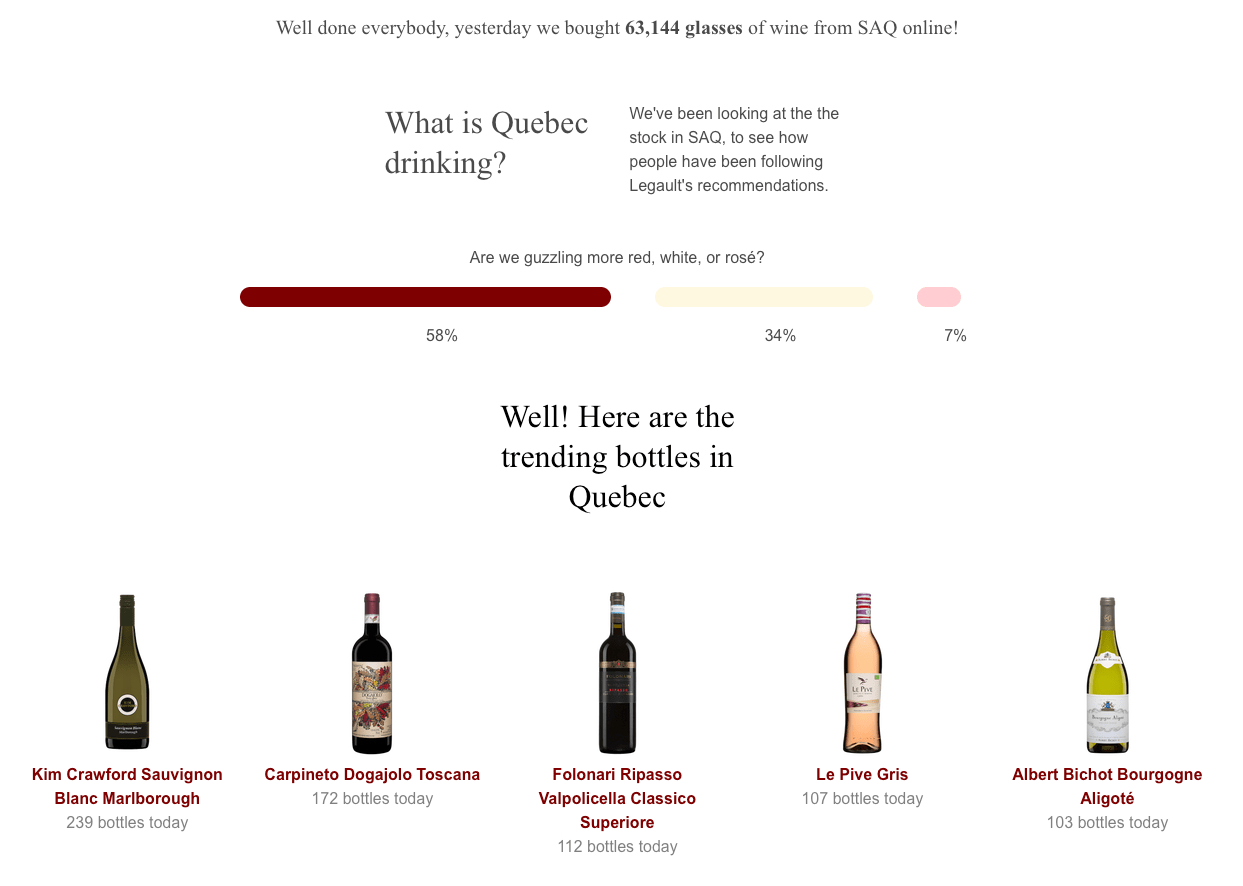
A Glass of Wine May Help
After the giddy success of the Calculator, Claudel and I were interested in making a followup which had slightly different qualities:
- Less techy: the calculator was pretty cool but it was a little ugly and templated. We wanted to create something more elegant.
- Light hearted: a few weeks into the crisis, reports of soaring case numbers and endless articles on testing and calculation of fatality rate were getting everybody down. We wanted to do something fun.
- Local: the Corona calculator worked for every country we could find data for. We thought it’d be interesting to go deeper on a more local theme.


I spent quite a lot of time scraping the SAQ website (nearly all of Quebec’s wine is sold via a centralized store, Société des alcools du Québec) and figuring out their AJAX in order to obtain an hourly summary of the availability of different types of wine. With a bit of munging, I could turn these into wine consumption numbers, and we turned it into a minimal (and rather beautiful, thanks to Claudel) site.

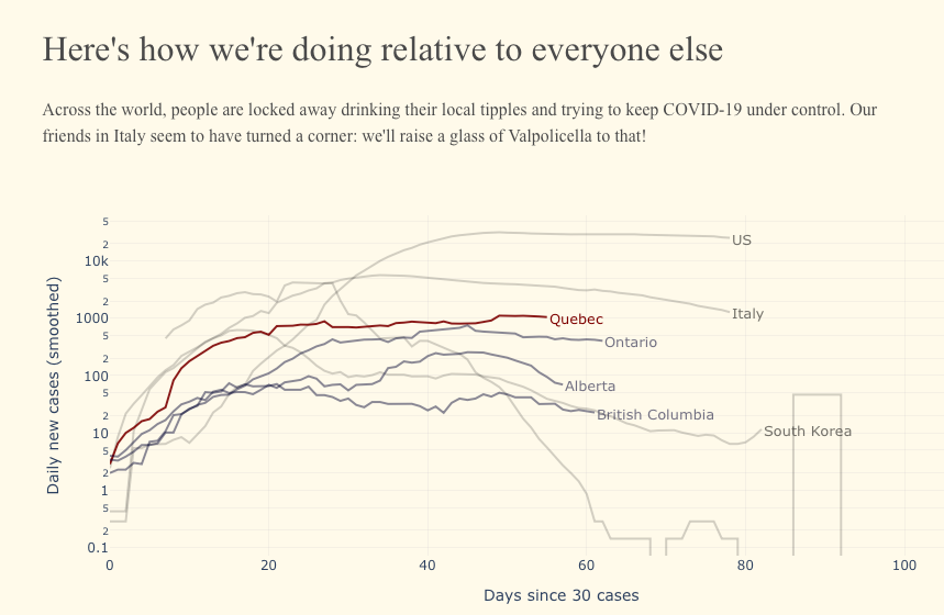
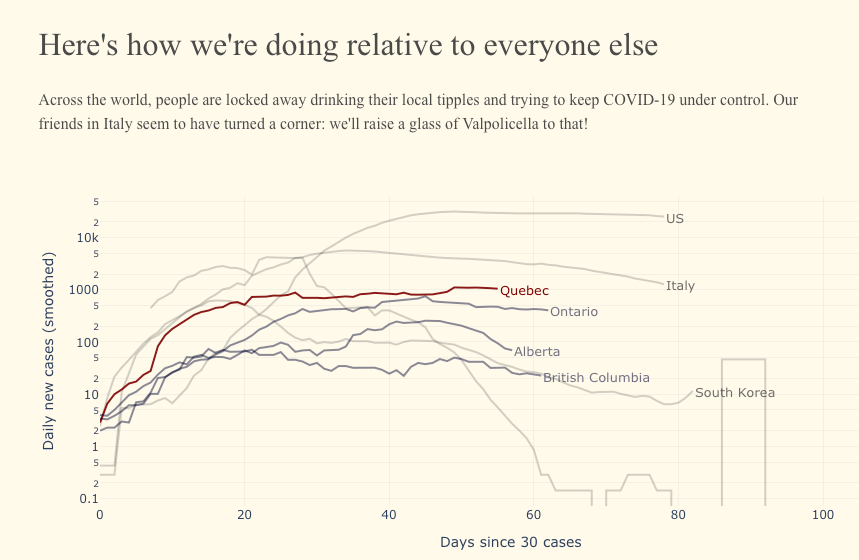
To keep it topical, we also included some of those lovely line graphs popularized by John Burn-Murdoch at the FT, my new data-viz hero.

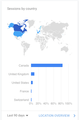
This was built in Flask with Bulma (along with Streamlit, one of my favourite tools of 2019). This mean we could include Google Analytics and actually keep track of who was visiting and where they came from.
We peaked at about 400 users in the week we launched, but we haven’t seen much traffic since then.

Reflections
People are already bored of COVID-19
This definitely felt like more of a data-enabled art piece than the Calculator, which was a piece of scientific communication. It was great fun being able to implement Claudel’s designs without the constraints conferred by Streamlit, and I enjoyed optimizing for mobile viewing.
However, it all took quite a long time, because I’m not a good frontend developer.
The actual scraping part was a bit of a nightmare, and rather frustrating, but I’ve been surprised by how robust it’s turned out to be; it’s still chugging away without issue.
All of this meant that by the time we got this out, the internet was already quite sick of COVID-19 content. Even our own enthusiasm for the project was faltering a bit by the time we shipped it.
Medium publications matter
I also wrote a reasonably good Medium post on this project – or so I thought.
Towards Data Science, who had published our previous piece, declined to publish this one, citing issues of “blurring the line between correlation and causation” and “we have to worry about sending the message to a large audience that staying in and drinking is proven to be a good thing”.
We thought this was quite entertaining, and a little conservative given how blatantly tongue-in-cheek the whole project was – but no hard feelings. Instead, we published in a far smaller and less popular journal called Noteworthy, which is a bit of a potpourri of content about start-ups and tech. We’ve barely seen any traction – the story only has 196 views.
Is interactivity key?
One possible contributor to the relative unpopularity of this project is that it was purely static: there was no interaction. I suspect this reduced engagement a lot.
Weather Window
I’ve been working on a project for outdoor trip planning on and off since Summer 2019, which I’ve been calling Wildly. It’s a generalization of an earlier project – Ski Monitor – which allows you to monitor the previous and current weather conditions at local ski hills. The ambition of Wildly was to make this bigger – allowing users to curate their own locations – and better, with associated trips and recommendations for new locations from other users.
It’s been a great project for learning React, improving my Flask skills, and tangling with lots of basic product issues (like authorization), but it hasn’t proved very useful. Trying to build something which combines weather, mapping, and social aspects of being outdoors in one package has proved complicated and confusing for early users.
However, out for a lockdown run at 8am – because this was the only time it wasn’t going to rain that day – I realized that there was a very simple pivot to make from Wildly. We could build an app that just told you the best hour of weather, every day, via a calendar invite.

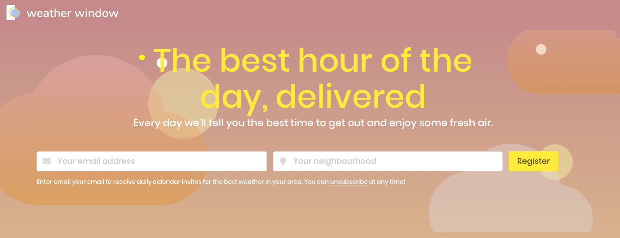
Claudel swiftly turned this idea into some gorgeous mockups and I spent an Easter Monday extracting the code I needed from Wildly to make it a reality.
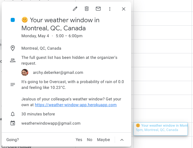
We’ve been using it for a few weeks and it seems to be genuinely useful. I’m very excited about the potential, and we have some interesting ideas for how to expand the functionality to provide more personalized and more useful recommendations for not only when to be outdoors, but what to do.
Reasons to be excited
We’ve only just launched Weather Window so it’s a bit early to reflect upon it. Instead, here are some things that I think are fun about it:
Recurring value to users
Corona Calculator and Glass of Wine were websites – you visited them once, perhaps you thought they were interesting, and you probably never visited them again.
If you find Weather Window useful, you’re going to extract a bit of value every day, which I love. This feels much less transient and transactional than a hit on a website, and has deeper potential to develop into a meaningful dialogue – and brand.
Self-propagating marketing
I’m hoping that by embedding the product into people’s calendars, we’re able to benefit from some of the wild virality that Hotmail and Apple captured when they added links to their products inside the emails that users sent.
Many companies have open calendars – meaning you can see what people have in their calendars – so I hope we’ll see natural spread of the product that way. It’s too early to tell whether that will work, but it’s a fun experiment.

Building on existing platforms
I like building things which integrate into tools people already know and love, and Google Calendar is one of them (at least for me). It’s elegant and efficient to build upon the foundations laid by other products, rather than forcing users to adopt something novel. Instead of requiring users to understand your world (as I was attempting with Wildly), you’re bringing useful functionality into the world they already inhabit.
Getting outside is great
I’m pretty keen on being outdoors, and if we can spend a bit of time indoors writing code which help lots of people get outdoors, that’s an awesome investment.
Thanks to Salman, Pat, and especially Claudel for keeping me entertained and enthused in these strange times.