Adding interactive Plotly graphs to WordPress
April 9, 2021
For a recent post I wanted to embed interactive graphs in WordPress, which I’ve never tried31.
I’m a massive Plotly fan, and since the release of their Express API I’ve not used any other plotting library.
However, getting Plotly graphs to render properly in WordPress turned out to be a real pain, and I also learned a bunch about formatting Plotly graphs for mobile. Here’s the summary, so I don’t forget.
Table of Contents
Toggle
Things that do not work
The official Plotly instructions
Plotly suggest you add a WordPress plugin to handle this! Hurrah, so simple.
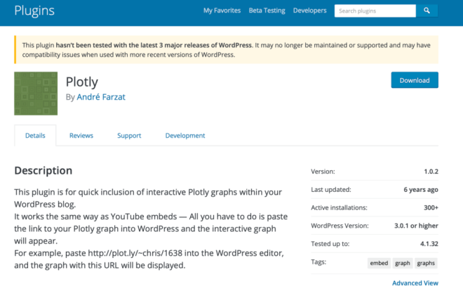
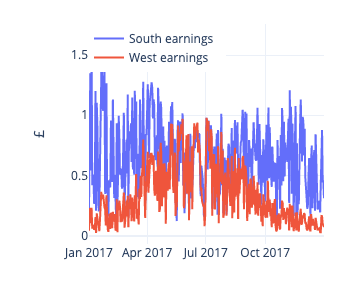
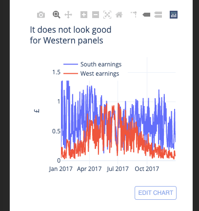
Except… the plugin hasn’t been updated for 6 years and seems incompatible with the current version of WordPress, because following the instructions yields static graphs like this one:

To be clear, I don’t blame Plotly for graveyarding this: they’ve got better things to do than catering to the very weird intersection of people technical enough to want to embed interactive graphs in blogposts and lazy enough to still be on WordPress.
Pasting HTML
Plotly graphs are pure JS/HTML, and so you can export the whole shebang as an HTML document and it’ll run just fine in the browser with no other dependencies.
WordPress has a Custom HTML block, so I tried just copying and pasting in the resulting file:
fig = px.line(df, x='Time', y='Price')
fig.to_html('copy_and_paste_the_contents.html')
This causes WordPress to slow down, stop saving, and eventually crash. There’s clearly an issue with embedding large quantities of JSON this way. I lost quite a bit of work because this broke WordPress’s autosave.
I’m not going to include an example here because the same thing will probably happen 😬.
What works
Embedding Chart Studio graphs in an iframe
Of the myriad ways to export your Plotly charts, one of the most powerful is the export to their online Chart Studio.
It’s pretty easy to setup, requiring a few lines of Python to authenticate, as described here.
You can then push your beautiful charts to the web:
import chart_studio.plotly as py

fig = px.line(df, x='Time', y='Price')
py.plot(data, filename = 'basic-line', auto_open=True)
Once they’re there, you can hit the </> symbol in the bottom right to open up an Embed panel, which contains a reformatted iframe:
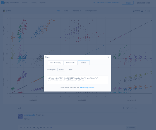
And if you copy and paste this into a Custom HTML block, everything is groovy:
It doesn’t break WordPress because the iframe is just a portal to the JSON elsewhere, so WordPress doesn’t have to try and save it.
This actually has further benefits, because it means you can effortlessly update your graphs from your Jupyter notebook and have them updated on your blog without doing anything!
fig = px.line(df, x='Time', y='Price')
py.plot(data, filename = 'basic-plot', auto_open=True)

# Actually I prefer an area plot
fig = px.area(df, x='Time', y='Price')

# Because this has the same filename, it will overwrite the last one,
# and your iframe will now render an area plot!
py.plot(data, filename = 'basic-line', auto_open=True)
This is a huge bonus if you’re fiddling with your graphs a lot.
One downside is that you’re dependent upon an external service to render your graphs, and if for some reason Plotly goes down, so will your charts. I’ve not found this to be an issue so far, and I trust them more than I trust my WordPress on Bluehost setup.
Optimizing your charts for mobile
I wanted my lovingly crafted graphs to render well on mobile. Iframe embeds are not particularly responsive, so here are a couple of tricks worth bearing in mind.
Make legends horizontal and put them at the top
Vertical legends take up valuable horizontal space, squeezing your graph.
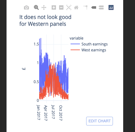
fig.update_layout(legend=dict(orientation='h', title=None, y=1.))
Strip out the modebar and the Edit Chart link
The toolbar (top) and edit chart link (bottom) add visual noise and crowding.
You can modify the embed code by appending query parameters to your iframe src:
<iframe width="900" height="400" frameborder="0" scrolling="no" src="//plotly.com/~archy.deberker/31.embed?link=false&modebar=false"></iframe>
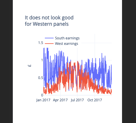
This makes things a lot cleaner.
Split your titles onto multiple lines
Plotly won’t wrap your titles, so you’ll end up with stuff offscreen:
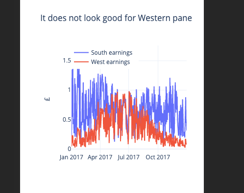
So you’ll want to add some <br> to your titles:
fig = px.line(daily, x=daily.index, y=['South earnings', 'West earnings'], title='It does not look good<br>for Western panels')
Let me know if this was useful!